The new year is upon us. Like everything else, packaging evolves at light speed.
Now that small players can compete with the big guys thanks to digital printing, standing out from the crowd is a must. Brands have only a tiny window of time to grab that consumer reaching for that bag of spicy taco tortilla chips on the grocery store aisle.
After seeing what’s been happening both in stores and online, along with noticing what our customers have been asking for, we’ve put together our predictions for 2023 packaging design trends.
Some of them might be obvious, and others might take you by surprise, but no matter what, a lot is going on in the world of packaging design.
One of our immediate takeaways is that consumers want packaging that offers a sense of calm and, in some cases, even nostalgia for a time when things didn’t feel so chaotic.
There are plenty of examples of subdued and complementary hues, with straightforward content and minimalistic fonts, which offers simplicity because, after all, shopping should not be a stressful process; there’s enough of that everywhere else.
What else can we look for in 2023?
1. Bold fonts
We’re not saying comic sans is about to have its big day, but bold fonts are in. Using typography as the centerpiece of the design is back in a big way in the design industry.
There are countless bold fonts created with ambitious stylistic points that designers are in love with using, and it’s pushing packaging into new realms. Instead of a big splashy design with a lot of time spent on over-the-top logos, some brands will lean more into clean packaging driven by text and engaging language with bold color contrasts.
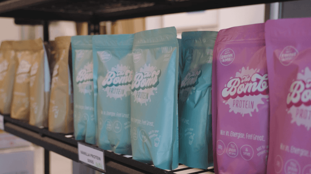
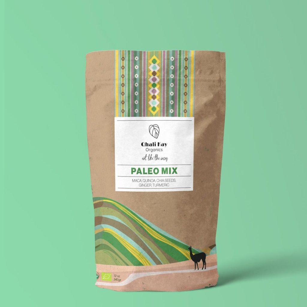
2. Minimalism
Another packaging design idea will be minimalism. For years, the packaging had to be bold, using big colors like orange or electric blue.
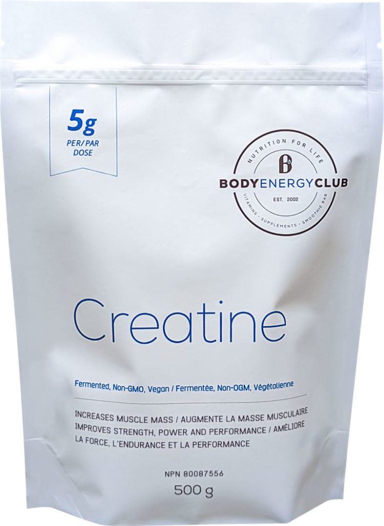
Today, minimalism is returning thanks to a push for simplicity, giving the consumer a feeling that your company has nothing to hide. Neat packaging lends an air of sophistication with clean lines, letting the quality of the product do the work instead of relying on gimmicks.
3. Color blocking
Designers are moving away from straight lines and focusing on curved curves, which makes packaging more natural, almost giving a handmade feel thanks to that minimalist design and bolder font choices.
4. Faux 3D Deco
But not everyone is on board with the minimalism train. Some brands are going for a look that’s very much of the moment with 3D graphic artwork that feels upscale by using optical tricks that give an impression of depth and signals their company is thinking about the future, not the right now.
5. The ’60s meet the ‘90s

If you’ve looked at fashion, it’s apparent that the rule book has been thrown out. Everything 90s is back in vogue while some of the bright, timeless design aesthetics of the psychedelic 1960s influence packaging with its adherence to love, happiness, and peace, which seems like a good idea after a pandemic.
From Nirvana-inspired fonts to IPA cans that look straight from the Haight-Ashbury, the rock and roll need for boldness with a sense of ideology is back in a big way.
6. Challenging the eye with depth
Another contrast to simplicity, some designers have been toying with deceptive depth, which champions producing three-dimensional graphics on two-dimensional surfaces using shadows or elaborate lighting on the fonts.
7. Words matter
One of the most critical aspects of Google’s new algorithm is that it pushes quality content over a paragraph stuffed with keywords. People are tired of seeing buzzwords repeatedly, and packaging is catching on.
Instead of using many catchy phrases and words that don’t mean anything, the packaging is moving toward getting to the point and building trust through a quality product rather than big promises.
8. Everything is a QR code away
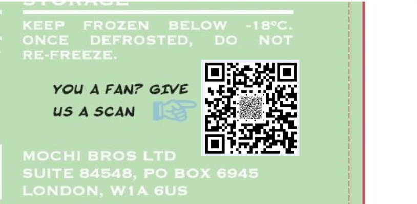
The usage of the QR code became mainstream during the pandemic once iPhones could scan them with the camera, but now, the QR is on everything. And by using the QR, brands can stick it on one the back of the packaging, letting the consumer enter their world, whether it be how to use the product effectively or their social media channels.
Many companies love this move because it creates a direct pipeline to the consumer. If someone signs up or follows, that’s invaluable market data and a place to communicate at length.
9. Earth-friendlier than ever
There’s always a push for eco-friendly packaging, and demand is only growing. Still, now it’s moving into a place of authentic ethical and biodegradable packaging, which shows the brand’s commitment to a sustainable future from ethically sourced materials or inks that won’t affect the earth as the package biodegrades.
Continual options are coming for eco-friendly packaging, and that’s only a good thing as laws pass worldwide to battle climate change. (We’ve written a lot about this.)
10. Symmetry meets complexity
To combat the minimalist trend, there’s also a call for intricate artwork focused on symmetrical design that offers order and cohesion. For some customers, this draws them in with a complex visual story that goes entirely against the narrative of simplicity.
Whoever chooses to go this route will do so to compete on their terms and against market trends, but it could be a big payoff for doing so.
Did we miss anything? What will be something everyone’s talking about in packaging this coming year?
Drop us a line. We’d love to hear your thoughts. And as always, if you’re looking to kick your packaging up a notch, big or small, medium or enterprise, around the world, ePac can help you hit your deadlines to market.