As a brand owner selling your retail product in brick and mortar stores, you may be familiar with the word planogram, sometimes referred to as POG. In the retail business, planogram is the term retailers use to describe the merchandising plan for the layout of the store.
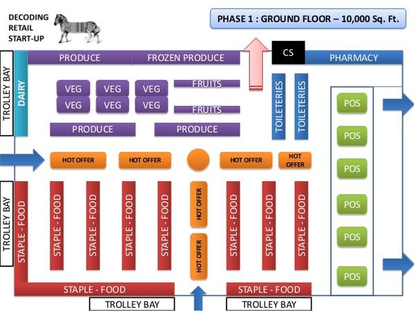
So how do planograms work? The official definition of a planogram is a schematic drawing or plan for displaying merchandise so as to maximize sales. It can be a diagram or model that indicates the placement of retail products on shelves, as well as the layout for the entire store. Here is an example of a planogram showing a store’s layout.

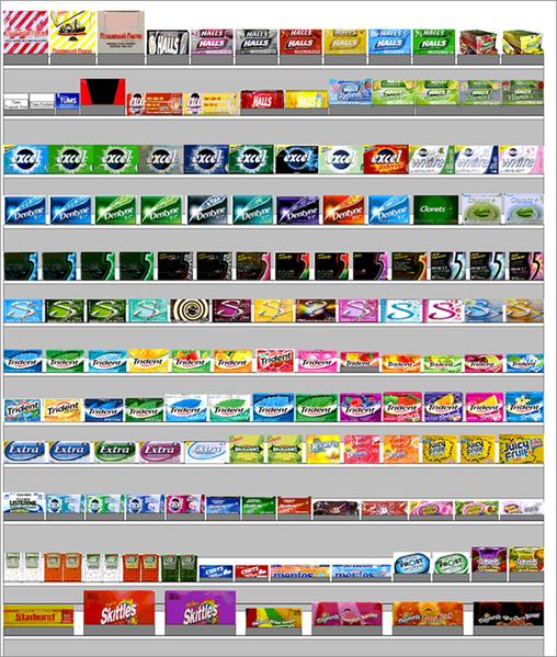
The purpose of planograms is to help keep stores efficient. Smaller stores like boutiques, and local or gourmet shops use them to maximize their selling space. And most large retailers utilize them as well. According to an article on The Balance Small Business, the largest U.S. retail chains like Walmart, Costco, Kroger, and Target, use planograms in merchandising to create consistency between store locations, improve visual appeal, and promote product pairing suggestions. They can also help retailers determine how much inventory they will need for each product. There are numerous benefits of planograms. Here is an example of a planogram showing the layout of one set of shelves.

Regardless of the size of the store, retail shelf space is limited and as such a planogram is useful to plan out and maximize space. But a planogram’s ultimate goal is to help the store drive sales.
Planning for Planograms
So, why should you as a brand owner care about planograms?
Knowing what planograms are and how they work can help you understand the part packaging plays in where things end up getting placed on the retail shelf. Since planograms help retailers maximize shelf space and draw consumers in, it makes sense that a more eye-catching, functional package could find its way to a more visible place on shelves.
So when designing your package, consider the merchandising plan for the store and how your package’s design, colour, size, and overall appeal can play a role in where it’s placed and thus what shoppers notice. That’s why the right materials and the right printing process is so important. You’ll want a quality package that consumers cannot help but notice, and in a package that feels good in their hands, while offering the functionality consumers crave.
Also, as you create your next package, consider how much shelf space your packaging is taking up. Boxes and jars can be bulky and take up more than their share of valuable shelf space. But if your product is sold in a stand up pouch, for example, it will fit nicely on the shelf and stand on its own. And since pouches take up less space on shelf than rigid containers, retailers can fit more of your product in the same space.
A Packaging Partner for Your Planogram Goals
Knowing what is a planogram merchandiser and how retailers use them is essential to creating packaging for brick and mortar stores. Understanding why retailers place products where they do can help you get a sense of what makes a great package. Knowing where your product is on shelf could even encourage you to re-think the logo placement, size of type, or colours, in order to increase shelf appeal. Keep in mind that since retail space is limited in stores of any size, having a package that doesn’t take up a ton of space is an important consideration. Are you thinking about how digitally printed custom pouches can help you stand out on busy store shelves? At ePac, we partner with brands of all sizes to create the best bags and pouches for your project, and they are always digitally printed, using high-quality films with photo-like images. Want to learn more? Call us today for a free quote.
